UX | UI Design
UX & UI designs created for the trend forecasting agency Trendstop and menswear brand and retailer The Savile Row Company. Below is the latest project completed and published for the latter.

The Project
The project was to re-design The Savile Row Company's existing E-Commerce website before migrating from Magento 1 to Magento 2. This included all existing pages: Homepage, Category Pages, Product Pages, Basket Page, Checkout, Header, Footer, Navigation, About Us Pages, Blog, Size Guides and all Icons. The main goal for delivering the best designs was to achieve a greater conversion rate and increasing revenue. To succeed this, the objectives were to realise a faster page load, minimise clutter, enhance the UX, facilitate the SEO and speed up the customer's journey through checkout. All of these in a mobile first approach considering the consumer's need for the best experience while being on the go.
My Role
My role was to lead this project from initial stages of conducting research and proposing all new concepts and direction, to wireframing and prototyping, creating all the new designs and testing in the required breakpoints based on the traffic movement found on analytics. All artwork was communicated to developers. Once the website was developed, all artwork and imagery was uploaded. Finally, providing the rest of the team with appropriate training on the new website features and CMS platform (Magento 2).
Homepage

The goal here was to strip the page down for least distraction. Also removing unneccessary elements in particular extra carousel banner rotations would result in a faster page load. Attention was given to the header. One of the objectives was to make the search button more prominent, facilitating the customer’s journey. Considering the age of the typical user (35-60yrs) the font size and prominence of key buttons was of crucial importance in all webpages and in particular the homepage.

Navigation
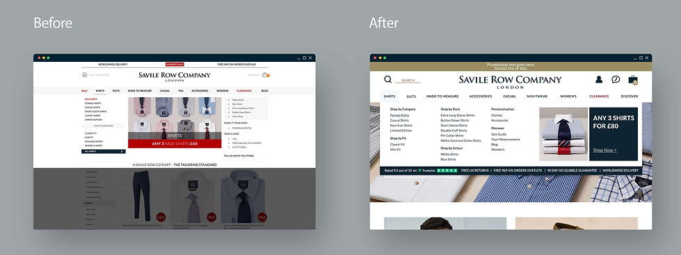
Hence the navigation’s existence is to facilitate the customer’s journey and endorse particular pages/categories/promotions, it needed to be easy for the customer to understand, provide all possible options and urge them to visit the different pages. In this case, everything was split in their respective category with a clear heading, one smaller image was placed to help customers to identify instantly the category they’re looking at, there was a clear position for the latest promotion, and the Trustpilot logo and reviews rates were placed to provide reassurance.
Category Page
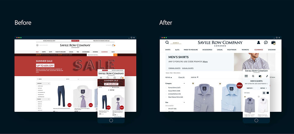
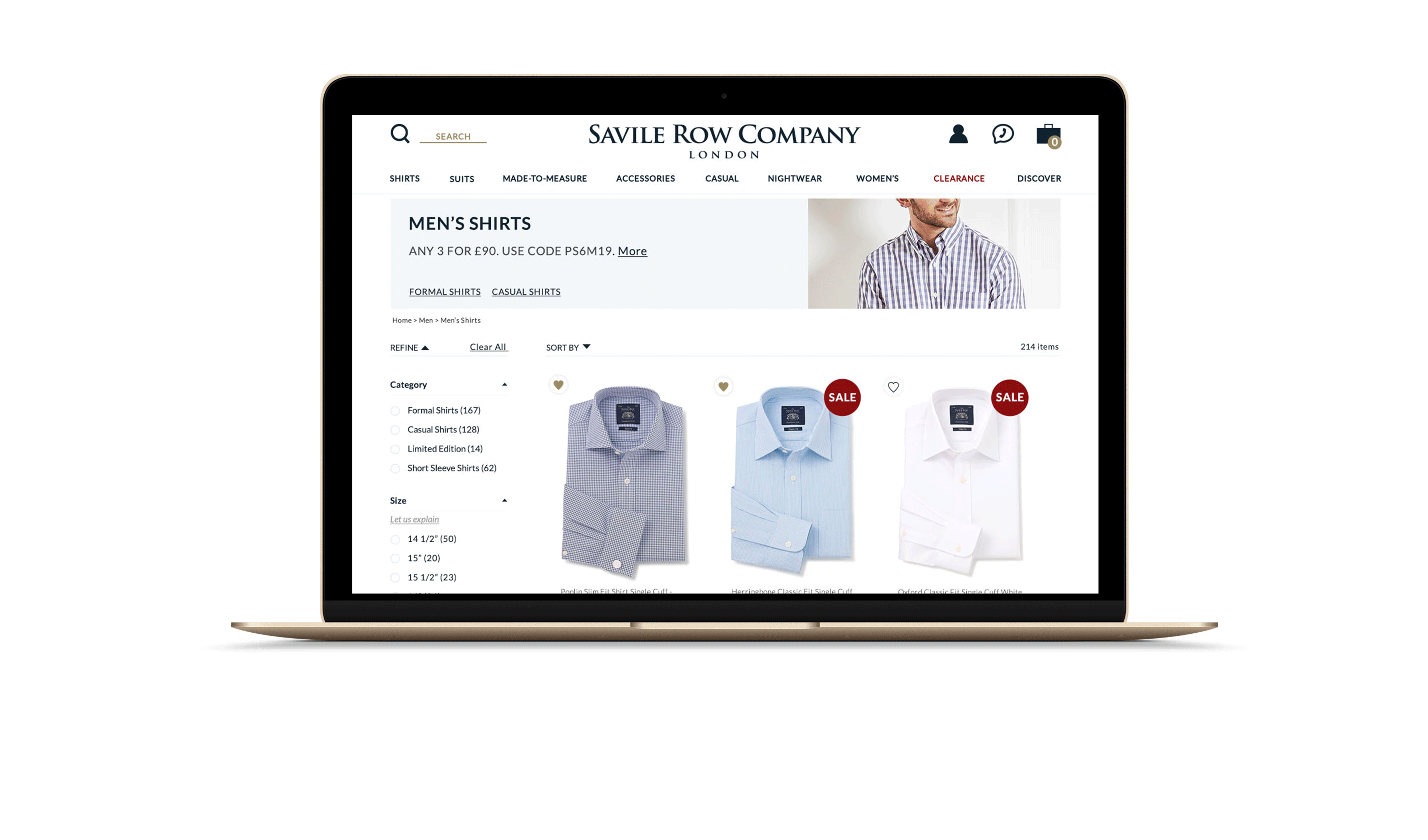
One of the obstacles in the customer’s journey was the slow page load. In order to improve this, all the website images would be optimised, and any unnecessary imagery to be reduced in size/dimensions or removed completely e.g the header banner of the category page on the mobile view was removed and on the desktop view downsized. Key links were added to the banner for greater SEO results, as well as cross-selling. The filter here was re-designed with a clearer structure and informational messages about each filter. This was done again to facilitate the customer's journey and prevent the necessity of abandoning the page in order to search the pages that included the size guide/fit guide/textile guide etc.
Product Page


The challenge in this page was to place all important information above the fold of the page for a better UX. By re-organising the page, removing secondary information/moving lower on the page, reducing unnecessary large copy this was succeeded. Again here images were optimised for a faster page load. Key selling points e.g promos & reviews were placed higher up the page. An indispensable role played here, the investigation of the customer's interaction with the page utilising heat maps.
Basket

Here the aim was to provide a clear and easy to navigate UX in order to make the customer's transition from basket page to checkout as quick and easy as possible and therefore generate more sales. All the payment details, promos, discounts etc were placed on the right hand side and continued on the same position in the preceding checkout pages to avoid any delays on customer's journey. It was important here to emphasise that the website is secure, and promote the most important selling points.
Informational Messages & Notifications

Again here the age of the typical user had a vital role in the design of informational messages and notifications. These included confirmation messages, errors and pop ups to make the user's journey smoother and create the urge to continue shopping rather that abandon the website.
Tools
The tools used from start to finish were:
Hotjar, Photoshop, Illustrator, InDesign, InVision, Zeplin, Google Analytics, Trello.